12. Using signatures
Find related gene signatures with a specified genelist or novel correlating gene signatures
12.1. Scope
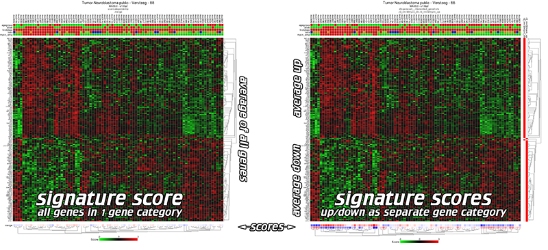
Within the current context, we define a signature as a collection of genes that are defined on a particular basis. This can be the presence within a gene-ontology class, the genomic location of a gene, or perhaps something potentially more meaningful like a functional pathway signature. Functional pathway signatures are mRNA proxies for a particular perturbation, such as the response to the downregulation of a gene, or the consequence of a targeted compound (drug). Especially in this context, the collection of genes may have predictive power for the activity of a process. Of course it becomes cumbersome to assess the activity on a gene-by-gene basis. It would be very handy if we could express the behavior of all the genes in a single value. Within R2, we can convert the behavior of a list of genes into a signature score that can be calculated for all samples within a particular dataset. This signature score is simply defined as the average zscore of a zscore transformed dataset (the standard way of visualizing a heatmap) (Figure 1). In R2, such scores are automatically generated when one generates heatmaps via the “view a geneset” function. With the exception of some exceptional cases, most functional signatures will be composed of both upregulated genes as well as downregulated ones. Using both as a single list may then become problematic, as downregulated genes may counteract the effects of upregulated genes, effectively leveling each other out. To circumvent this problem, we can create 2 separate gene categories, one containing only the upregulated genes, and one containing only the downregulated genes. R2 will recognize couples of gene categories if they follow a specific convention (fixed prefix, followed by _up and _down; e.g. mycn_up and mycn_down).

Figure 1: Signature score: one category vs up/downcategory
- What is a genesignature
- Create a track using the weight scores of a genesignature
- Relate a weighed genesignature track to a single gene
- Find correlating genesignatures with a track
![]() Did you know that you can create gene category couples
Did you know that you can create gene category couples
R2 can treat particular gene categories in a special way if you follow a simple naming convention. Especially helpful for signature scores are up/down regulated gene couples. Within the “view a geneset” function, you can select multiple gene categories to be used in for the heatmap. If you select 2 categories that contain a fixed prefix, coupled to _up and _down (or _dn), then R2 will treat them as a couple, and will subtract the downregulated signals from the upregulated ones (effectively creating a signature score). We can weigh the 2 separate lists of genes either equally, or weighted as a percentage of the number of genes (the weighted_match / _wm signatures).
12.2. Step 1: Creating a geneset signature, a Track within R2
As a start, let”s create the signature scores for a pair of gene categories. In this tutorial, we will make use of a published functional MYCN pathway activity signature that was created on the Neuroblastoma 88 dataset (Valentijn et al 2012). This signature is provided within R2.
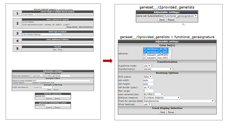
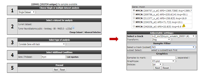
We start at “Main”. Make sure that the “Single dataset” option is selected in “box 1”.
In “box 2” verify that the current dataset is “Neuroblastoma public - Versteeg - 88 - MAS5.0 - u133p2”.
In “box 3” we select “View geneset (Heatmap)”. Click “Next”.
In the following screen we select the “geneset__r2provided_genesets” Gene set collection and click “Next”.
In the following screen we select the “functional genesignature” subselection and click “Next”.

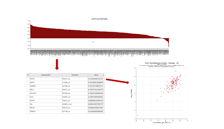
We can now see the lists of genes that are represented in this collection. While holding the CTRL key pressed, we can select the following 2 gene categories “r2_imr32mycn_dn” and “r2_imr32mycn_up”. Then click “Next” (Figure 2).
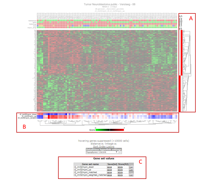
R2 will produce a hierarchical clustered heatmap image of the selected gene categories. Note that at the right side of the heatmap the red markings indicate in which category a particular gene was represented (Figure 3, box A). In the bottom part of the heatmap (box B in Figure 3), a blue-white-red colorscale is depicted for both gene categories. We can clearly see the opposing effects of the 2 signatures. A third colorscale depicts a weighted score, based on the contributions of both signatures (see point 8).
Scrolling down on this page, we will encounter a heading “Gene set values” (Figure 3, box C), which presents a small table. The links within this table point to the numerical values of the geneset scores. For the 2 gene categories, R2 will create the scores of the 2 separate categories, a matched score (where up and down regulated genes are treated equally (50/50)), and a weighted_matched score (where up and downregulated genes are treated on their contribution (percentage for number of genes)). Click on “store” for the “weighted_matched” signature, so that we can perform additional analyses on it.

Figure 3: A) Gene set marking per gene; B) Signature score; C) Links for further analyses
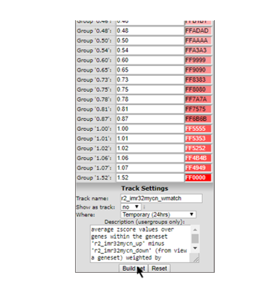
R2 has now assembled the information into a prescription to generate a track. By default R2 will store the track for 24 hours, which is fine for the current tutorial. Click on “Build set” to store the new track (Figure 4).

Figure 4: Generating a Track from a gene set Signature Score
12.3. Step 2: Determine the activity of a signature
Now that we have created a signature from our 2 lists of genes, we can start using it as if it was a gene itself. For example we can inspect how the MYCN pathway activity signature correlates to the MYCN gene at the mRNA level.
Go back to the “main” page and select “correlate gene with track” from “box 3”. In “box 4” we provide “MYCN” and click “Next”.
On the following page, we select our newly created track in the “select a track” dropdown box and click “Next” (Figure 5).

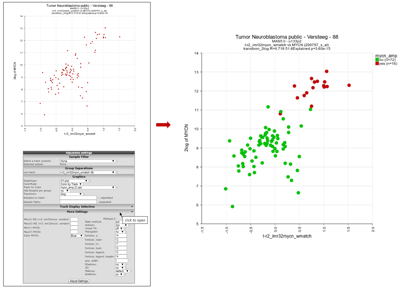
R2 will now produce a plot where the signature score for every patient is related to the MYCN mRNA expression value (Figure 6).
We can make this look a bit prettier by adapting the color for patients on the basis of e.g. MYCN amplification status. To achieve this, we go to the “adjustable settings” at the bottom of the page and select “Color by Track” from the “ColorMode” and select “mycn_amp” from the “Track for color” option. Also check out other settings, such as the dot size, that become available when you click on “More Settings”. Click “Adjust Settings” to redraw.
We can now clearly see that MYCN amplified patients have a higher MYCN gene set activity score. The possibilities for numerical tracks are endless with some smart questions (Figure 6).

12.4. Step 3: Using signature scores
Now that we have related the signature to a particular gene, it is easy to envision that this can be done as an analysis as well, where the signature is correlated to all genes in the genome (”correlate with a track “ in “box3”). A lot of signature gene lists have been designed and published in literature over the past years. We can convert all of these into signature scores and start searching for relations of these meta-genes with our signature of interest.
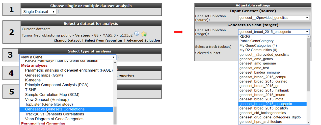
Go back to the “main” page and select “Geneset vs Geneset correlation” from “box 3” and click “Next” (Figure 7, left). If this analysis is not available for your account, email R2 Support (r2-support@amc.uva.nl) for an upgrade of your account.
On the next page, select at the input Geneset -> Gene set Collection (source): “geneset__r2provided_genelists”. In the Genesets to Scan (target): select ‘geneset_broad_2015_oncogenic’ (Figure 7, right). Then click “next”.

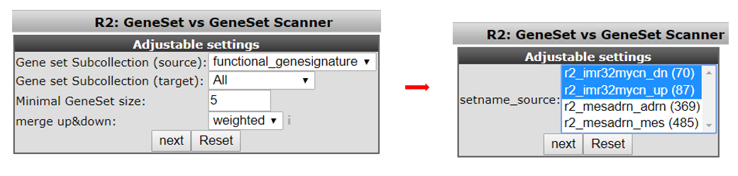
In the next screen select in the source pull downmenu “functional genesignature” and “ALL” in the target pulldown menu. Leave the remaining settings to their default and click ‘next’ (see Figure 8, left).
The gene signature consists of two parts. One set of genes which are up regulated by MYCN and one set of down regulated genes. In the next screen select both presented gene lists by holding the Ctrl- button (see Figure 8, right) and click “next.”

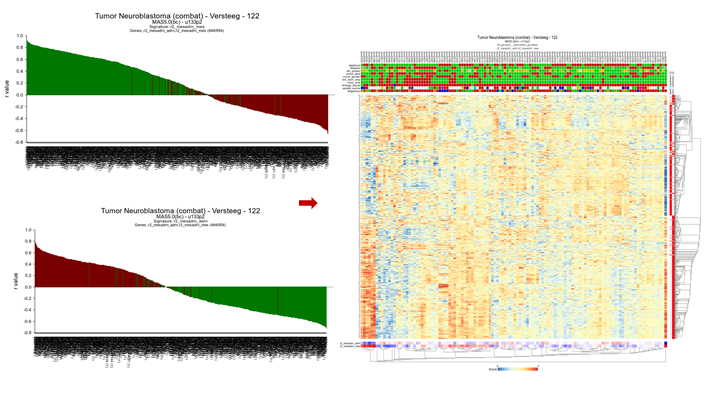
R2 has now generated all the possible correlations for the selected MYCN signature geneset against all the gene lists within the broad oncogene category. This results in a table of geneset versus geneset correlations sorted by the p-value. The “venn source/ same / target” column provides insight in overlapping number of genes (same) between two gene lists (source and target). Another informative parameter in the table is the range parameter in the last column. This value indicates the range of geneset scores in gene target signature.
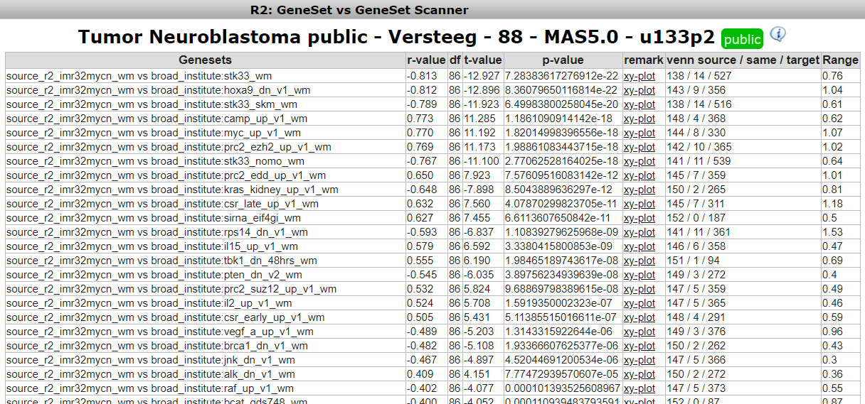
To inspect the correlation in more detail, we can click on the “XY-plot” link.
Now R2 has generated an XY-plot of all samples in the dataset. The XY values represent the signature scores for the 2 signatures for every sample. Below the image the overlapping genes in the 2 signatures are listed (see Figure 10, left side).
We can also inspect the target signature as a heatmap by clicking on the “View heatmap of “, providing gene-by-gene information (see Figure 10, right side).
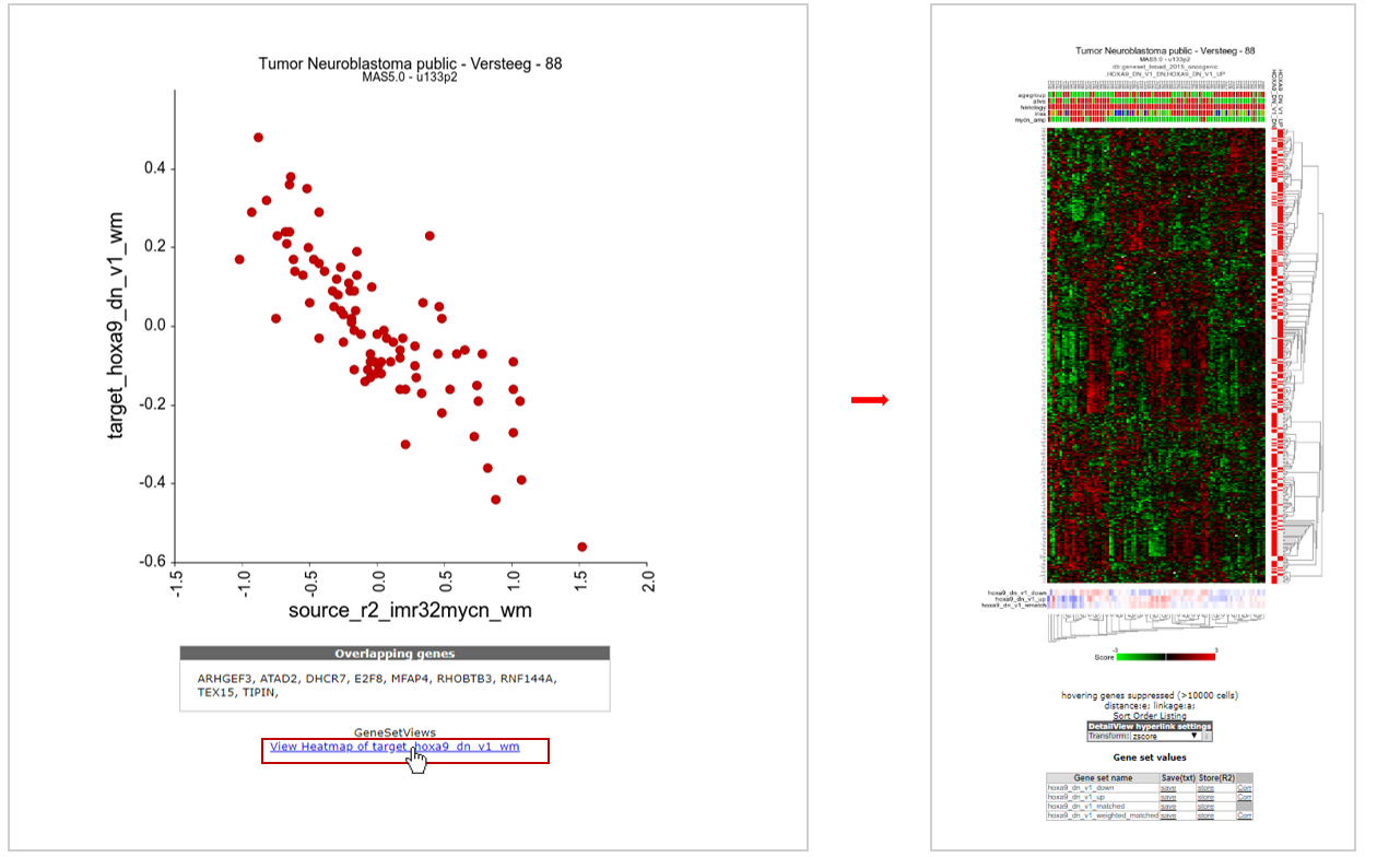
Figure 10: XY signature score plot and heatmap of correlated gene sets
12.5. Step 4: Plot signature scores using the relate 2-tracks module.
In the previous steps we have plotted the genesignature scores directly from a list of geneset vs geneset correlations. We can also select and use genesignature scores to plot a XY-plot in the relate 2 track module from R2. In this example we will use MES and ADRN (mesenchymal, adrenergic) genesignature scores generated on a combined dataset of neuroblastoma cell lines and 5 neural crest derived cell lines published by (Groningen , Koster et al 2017).
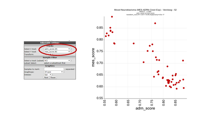
Go back to the “main” page and select the dataset Mixed Neuroblastoma (MES-ADRN-Crest-Exp) - Versteeg - 52 - MAS5.0 - u133p2 in box 2.
In Box 3, select the “Relate two tracks” module and click next.
In the next screen select in the pull down menu at X-track , adrn_score (#) and at Y-track the mes_score (#) and click next. Now a XY-plot is generated representing the correlation of the two signature scores. However, a clear significant correlation between the two signatures is shown. The biological relevance is less prominent so far.
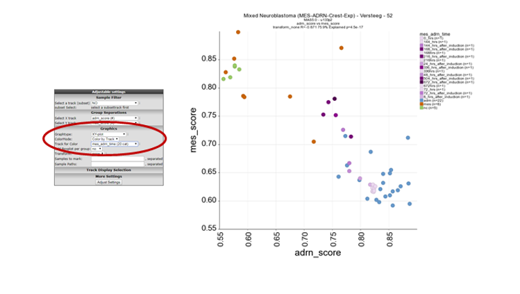
In order to visualise the biological relevance of this correlation plot. Select at ColorMode , “color by track” and at track for color the “mes_adrn_time” track in the pulldown menu, click adjust settings.

In this new plot, mes defined cell lines cluster together with the neural crest derived lines in the left upper part of the plot (orange and green respectively) and the ADRN lines in blue in the right lower part of the plot. The purple dots represent a time-series experiment where PRRX1 overexpession induces in time a transition towards MES defined cell lines. This is clearly shown by the dark purple colored dots where the light purple colored dots are controls or early time points.
12.6. Step 5: Drawing lines between samples in a XY plot
Sometimes it can be useful to indicate a relation between different samples within a dataset. In this case it could be informative to add a line between samples connecting the shifting samples in time. Let’s give this a try by defining the time series samples within this dataset.
Path properties: The appearance of the line can be influenced by providing a color (hex number) and a linewidth. The recipe for these adaptations makes use of ‘:’ and works as follows. sample1,sample2:colorcode:width. In the Sample paths box; Add ‘gsm2413257, gsm2413247, gsm2413248, gsm2413249, gsm2413250, gsm2413251, gsm2413252, gsm2413253, gsm2413254, gsm2413255, gsm2413256:#222222’ and click “Adjust Settings”
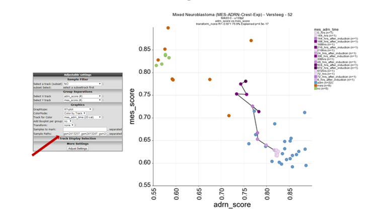
In figure 13 now the samples of the time series are connected and follow the transition from ADRN defined cells to MES defined cell lines in this dataset.
![]() Did you know box
Did you know box
R2 uses a couple of markup options for points in a graph, you can enable these in the advanced prescriptions:
- ‘dot’: places a thick border around the sample
- ‘circle’: Places a ring around the sample (diameter 9)
- ‘circle_2’: Places a ring around the sample (diameter 4)
- ‘circle_3’: Places a ring around the sample (diameter 1), effectively a thin border
- ‘epicenter’: Places a set of 3 rings descending in width around a sample
- ‘arrow’: Places a block arrow pointing to the sample
- ‘triangle’: Places a filled triangle under the sample
Note: The dotsize does not scale with ‘arrow’ and ‘triangle’
12.7. Step 6: Signature Gene correlations
You can use the gene signature correlation option in order to identify genes which correlate best with the gene signature you are investigating.
In the ‘Gene set values’ table below the Heatmap of Step 1, where you stored the genesignature score previously, this time click the link ‘Corr’ (Figure 3, box C).

This option generates a graph were the R-value is ranked from the highest to the lowest correlation for each member of the gene set that you used to generate the signature score. Clicking on a row in the table will generate a XY-plot. The scatter plot shows the gene expression (Y-axis) against the signature score value (X-axis) for each sample.

You can also select multiple categories to investigate the individual contribution of genes to a signature score. R2 will automatically keep the coloring for the separate gene categories.
12.8. Final remarks / future directions
Everything described in ths chapter can be performed in the R2: genomics analysis and visualization platform (http://r2platform.com / http://r2.amc.nl)
We hope that this tutorial has been helpful, the R2 support team.