5. Annotation analyses
Using (custom) annotation tracks as input for analyses
5.1. Scope
As you know by now, annotation of your data is stored in R2 as “tracks”. Within R2, one can easily create new annotation tracks. This can be done either based on results generated within analyses, or completely independent by uploading of tracks. In some cases it is of interest to start comparing one track with another. The type of statistics used to compare the tracks depends on the type of data; either categorical or numerical. One may wonder if there is significant overlap between 2 tracks (with categorical variables), based on Fisher’s exact test. Alternatively, if there are multiple numerical tracks available; one may wonder if there is a significant correlation between 2 tracks. For these cases, R2 contains the Annotation modules; “relate 2 tracks” and “annotation plotter”.
- Relate 2 tracks (categorical); test significant overlap and view as honeycomb-plot.
- Relate 2 tracks (numerical); assess significance of correlation and view as XY-plot.
- Relate 2 tracks (categorical vs numerical); assess differential values between groups.
- Annotation plotter; visualize tracks within sample cohort.
- Sunburst plotter and others; visualization options of tracks within a sample cohort.
5.2. Step 1: Relating 2 (categorical) tracks
Make sure that you are on the “main” page of R2, and that the selected dataset is “Tumor Neuroblastoma public - Versteeg - 88 - MAS5.0 - u133p2”. In the ‘Select type of analysis’-box (3) select “Relate 2 tracks”, which can be found in the annotation subsection and press ‘Next’.
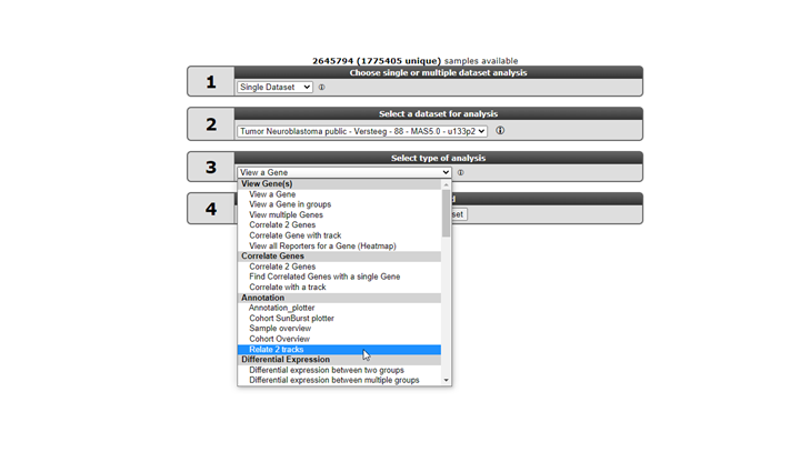
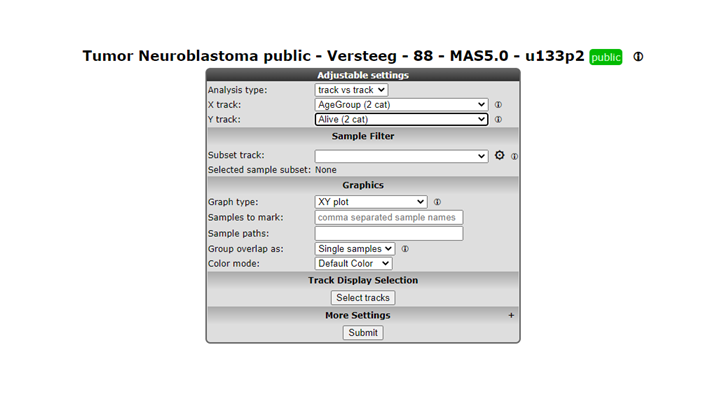
For the different tracks, make sure that you select a categorical one (which can be recognized by (cat)). We investigate whether there is a relation between the neuroblastoma age-group (track=agegroup, flip point being 18 months at diagnosis) and the survival status (track=alive). Select the ‘XY’ plot in the graph section. Then press ‘Submit’ to generate the result.
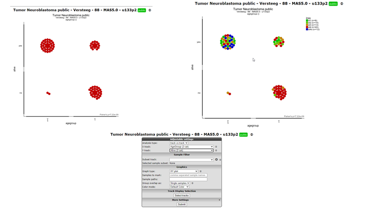
The generated result is now displayed on the screen. As we are testing 2 categorical variables, R2 has tested the relation between the 2 tracks and finds a highly significant Fisher’s exact p-value, indicating that there is a relation between the agegroup and vital status of the patients. The result is also shown in a honeycomb image, where every individual patient is represented as a separate circle, with the annotation as a hover box.
One can add more visual information to the plot, by coloring the patients on the basis of a track. From the adjustable settings at the bottom of the page, set the “colormode” to “color by track” and select “inss” as track. Press the ‘Submit’ button to create an updated image. Now we can clearly see that there is a great over-representation of stage 4 patients in the group of deceased patients who are older than 18 months. As you may appreciate, the combinations that you can make here are virtually endless. We have named this analysis the ‘Visual Fisher’s Exact test’, due to the visual additional insights that it provides over the ‘normal’ p-value that can be interpreted for this test.
To compare the absolute or relative shares of track values between subgroups of another track, you can use the “Stacked Barplot” or “Stacked Barplot ratio” respectively. The “Stacked Barplot ratio” option scales every group to 100%, and thereby shows the relative contribution of the different groups.
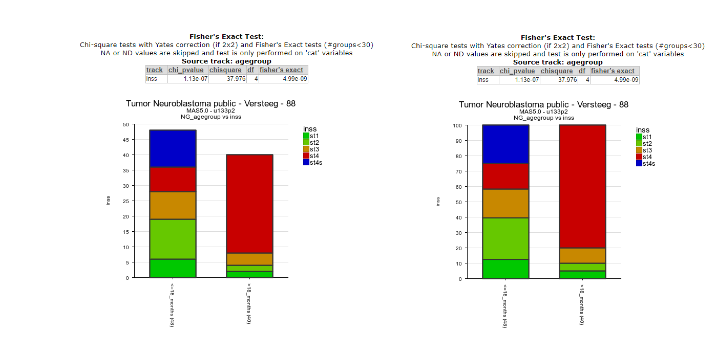
Figure 4: Absolute (left) and relative (right) stacked barplots
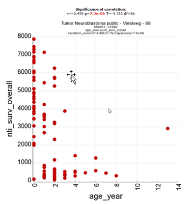
5.3. Step 2: Relating 2 (numerical) tracks
Just as in the previous example, we select the “relate 2 tracks” option from the main R2 screen and click ‘Next’. Now this time, we select 2 numerical tracks, which can be recognized by the (#) sign at the end of a track. Within the Neuroblastoma dataset our options are limited for this example, so we select the “age in years” track vs the “nti_surv_overall” track and proceed to the next screen.
In the result page, R2 has detected that 2 numerical tracks were selected, so the correlation between the different tracks is being displayed and tested for statistical significance. Just as in the previous example, we could color the patients by a track if that would be appropriate.
5.4. Step 3: Relating a categorical track to a numerical track
The last example for relating 2 tracks, involves the combination of a numerical one to a categorical track. Essentially, this option allows you to test meta-gene data (such as combined expression values of multiple genes expressed as a single value) as well, where you could create a track containing only value information for the patients, and test this track to clinical parameters. We again select “Relate 2 tracks” from the main menu and navigate to the next page.
From the track options, we choose a categorical track for X (inss stage), and a numerical one for Y (nti_surv_overall) and navigate to the next page.
The result page will now start to look like view a gene in groups, only this time using the data contained in your track. Via the adjustable settings, you can change the representation to another plot type, such as a boxplot, change the colormode to color by track, and you have a nice result here, showing that the survival rate is significantly lower in patients of INSS stage 4.
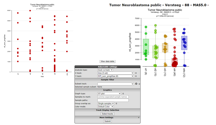
Figure 6: Representing the relation between categorical and numerical tracks
As a recap for the last 3 tutorial steps, you have used the “relate 2 tracks” option from the annotation methods in R2 and represented different types of tracks with each other to gain new insights from combining 2 tracks. Below, the three different representations are depicted side by side. Do remember, that this module allows you to use “meta data” tracks that you can assemble either within, but also outside of R2 via the uploading of a track option that will be shown in the “adapting r2 to your needs” chapter.
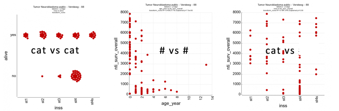
Figure 6: “Representations of relations between different types of tracks in R2
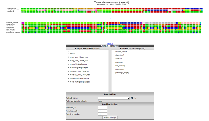
5.5. Step 4: Annotation plotter and Cohort Overview
In some publications, patient data is represented in slick looking annotation plots, showing the patient characteristics in rectangles. In a sense, these are just like the tracks that are represented underneath YY-plots in R2. To allow users to create these “track” figures, ordered in a user provided order, we have implemented the annotation plotter in R2.
Make sure that you are on the “main” page of R2, and that the selected dataset is “Tumor Neuroblastoma public - Versteeg - 88 - MAS5.0 - u133p2”. From the “Select type of analysis” dropdown select “Annotation plotter”, which can be found in the annotation subsection and press next.
The default view for the dataset will be plotted. Now one can change the tracks to display as well as the order in which the samples should be ordered. For removing tracks, drag the trackname out-side the selection box and click submit. Hold en drag the track name to adapt the order in the list of the right selection panel. The order in which tracks are selected for ordering will also dictate the final sort. For some complicated sorts, it may be necessary to create a numeric track that puts the sample in the intended order.

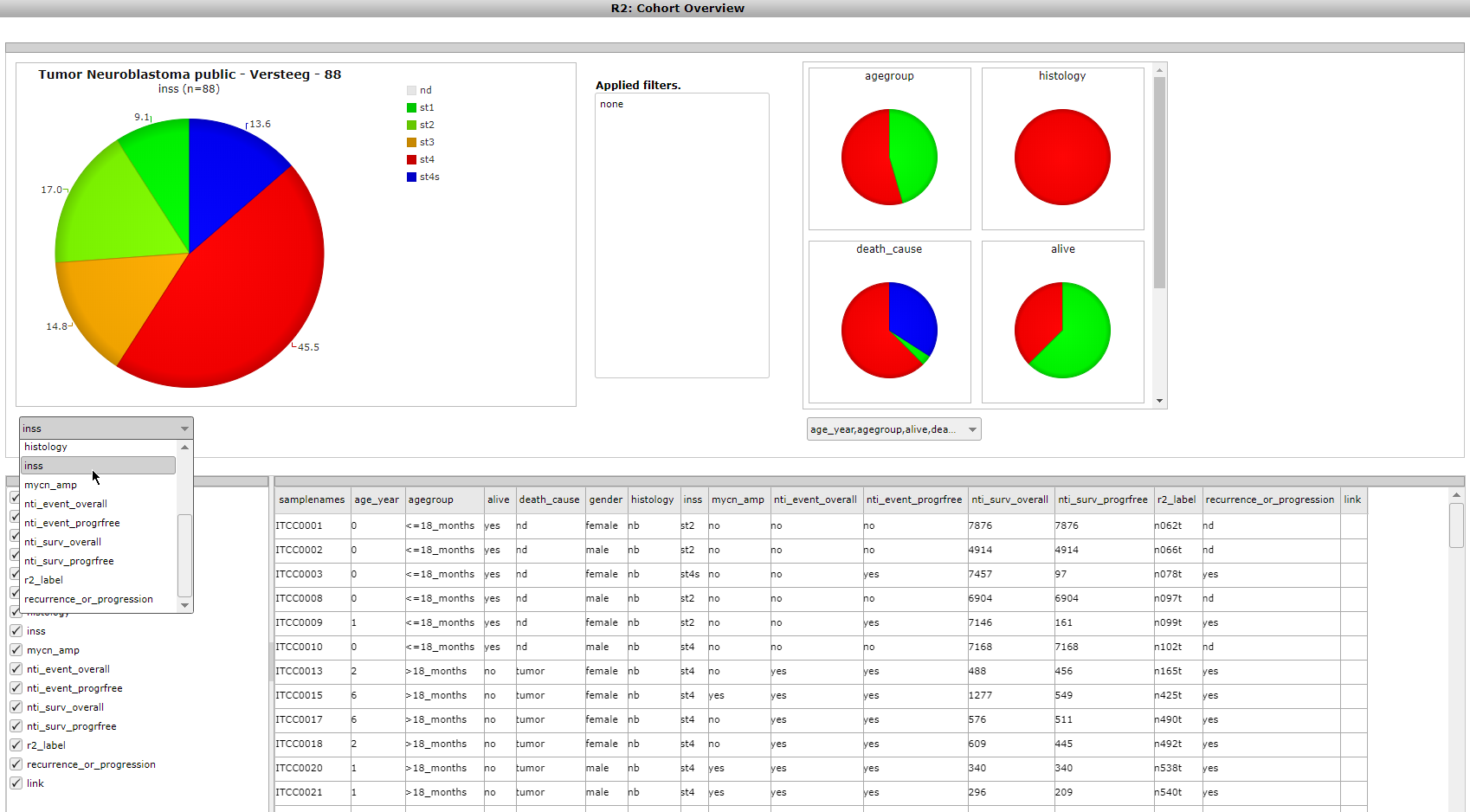
Another often useful overview is provided by the Cohort Overview. Click on ‘Go to Main’ in the upper left corner, and this time select “Cohort Overview” in box 3 with the “Select type of analysis” dropdown. Then click ‘Next’.Here, pie charts show the shares of the different values of a track. You can visualize tracks with the dropdown menus, hover over the different pie slices, and create a table overview with the values of different tracks of choice for each sample.The ‘Build a track’ button at the bottom of the page conveniently allows you to directly build a track from any selection of available tracks.

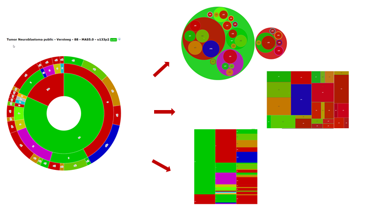
The sunburst plotter is an often used annotation visualization. In the annotation section of the main menu, select the Cohort sunburst plotter. The sunburst diagram displays a hierarchical structure in a circular shape. The origin of the organization is represented by the center of the circle, and each level of the organization by an additional ring. Additionally, other visualization plot types are implemented as illustrated in Figure 9 (circlepack, treemap and icicle).

5.6. Final remarks / future directions
Some of these functionalities have been developed recently. If you run into any quirks or annoyances do not hesitate to contact R2 support (r2-support@amsterdamumc.nl).
We hope that this tutorial has been helpful,the R2 support team.