7. Find genes correlating with your gene of interest
Or how you can find genes that have similar or opposite expression patterns in your dataset of choice
7.1. Scope
- R2 allows you to explore the relations your gene exhibits with other genes in your dataset of choice; correlation statistics is used to calculate this.
- The expression of a set of genes correlating with the expression of MYCN in a series of Neuroblastoma tumors is used to demonstrate that in this tutorial.
- The results can be further explored in one-on-one graphs or as a heatmap.
- The set of genes can be further explored statistically in several
domains as will be shown in this tutorial:
- In a gene ontology analysis
- On pathway maps
- On a chromosome map
- Using this exploratory analysis, new biologically relevant hypotheses can be generated as will be shown in this tutorial by an example concerning MYCN and MCM genes.
- The data can be saved and used in other tools.
- Further advanced analysis based on the use of sets of genes can be found in the Kaplan scanner and GeneSets tutorials.
7.2. Step 1: Selecting data
Logon to the R2 homepage using your credentials and make sure the “Single Dataset” option is selected in field 1 of the R2 step-by-step guide.
Make sure the “Tumor Neuroblastoma public dataset” is selected in field 2 (For additional information on these first two steps, consult tutorial: Working with datasets).
In field 3 select “Find Correlated genes with a single gene” (Figure 1) and click “Next”.
In the next screen, type ‘MYCN’ in the gene/reporter field and select the first reporter.
Click “Submit”.
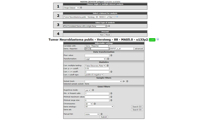
In the adjustable settings, we set the p-value cut-off to 0.001 and leave the further settings at their default. Note in Figure 1 that you can select for both correlation directions or a single one. The p-value, r-value cut-offs and multiple testing can be adapted. Scroll down the screen and click “Submit”.
![]() Did you know that you can find the correlation between two genes directly?
Did you know that you can find the correlation between two genes directly?
Just choose ‘Correlate 2 genes’ in the main menu in box 2 if you have a specific gene you want to correlate with your gene of interest. Of course this method would be rather tedious if you want to find new genes, hence we are exploring exactly this scenario in this tutorial. Another possibility is to correlate your gene with a track (containing numerical data). This essentially tests whether the expression of your gene of interest correlates with the numerical order described in the track. This scenario is further explored in the ‘Differential Expression’ chapter.
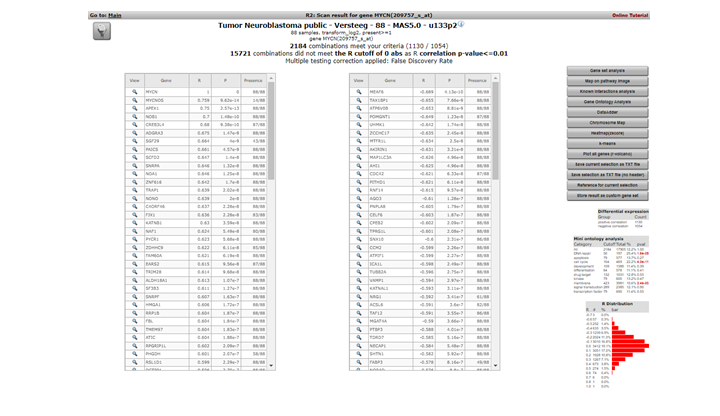
7.3. Step 2: Inspecting correlating genes
R2 calculates the correlation of the expression of MYCN with the expression of every other single gene in the current dataset. A lot of calculations! The result is presented as two tables (Figure 3 ). In the header a summary is given: ~ 2200 combinations of MYCN and another gene met the criteria, i.e. having a significant correlation (p < 0.01) with the expression of MYCN, ~ 15000 genes did not obey these criteria. The left table represents the genes whose expression correlates positively, or is similar, to that of MYCN in this dataset. Of course MYCN has a perfect correlation with itself. Some characteristics of the genes are already described in red. R and p-values are given in separate columns (for a short description of their meaning, consult the ‘Differential Expression’ tutorial).

Figure 2: Genes whose expression correlate with that of the MYCN gene in 88 Neuroblastoma tumors
Exact (gene-) numbers listed in the tutorial. Figures such as in this example (2184 combinations) can vary. This is caused by database updates upon a new genebuild release or from a commercial platform such as Affymetrix annotation update.
The right table summarizes the genes that show a negative correlation; the expression of MYCN behaves opposite to that of these genes.
A little table to the right summarizes the results of a limited Ontology analysis. More about that in subsequent steps where we also explore the menu items to the right. All gene names are clickable to explore the specifics of the correlation in a separate graph; try and click the APEX1 gene in the left column.
In the left upper corner the filter icon is located, this links directly to the “adjustable settings panel “ where you adapt the filtering conditions. The filter button is accessible in many analysis modules of R2.

7.4. Step 3: Inspecting correlation between specific genes
The resulting graph depicts the expression of both genes in this tumor series in a graph. The tumor samples are ordered by increasing MYCN expression. Note that the expression of APEX1 follows the expression of MYCN quite good! This is reflected in the R and p-values that are quite significant.
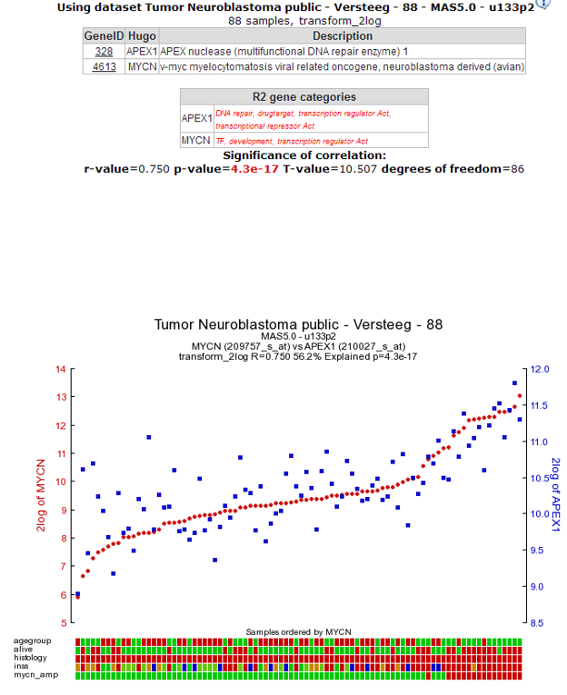
Figure 4: The expression of the MYCN gene correlates with the expression of the APEX1 gene.
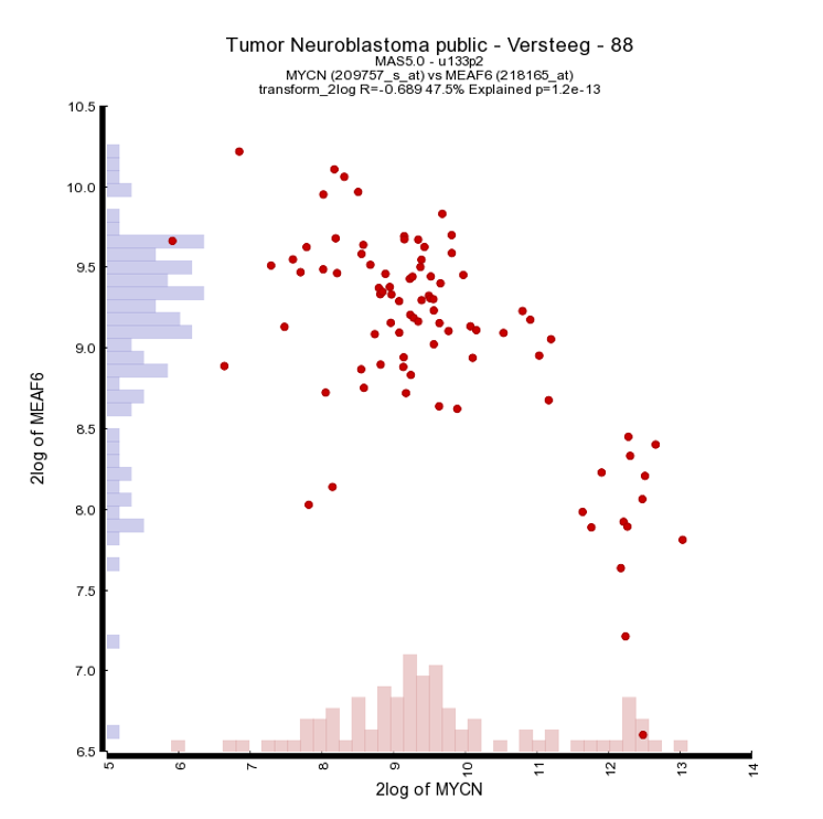
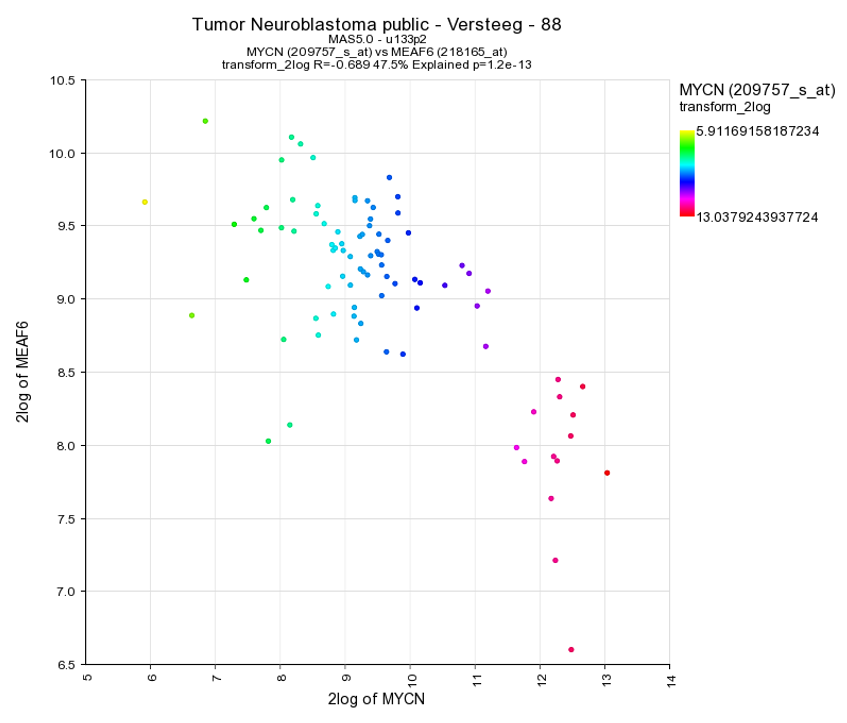
As an example of the opposite, click on one of the top genes in the right column figure 2 ; MEAF6. This produces Figure 6. The original list of results is still open in another tab in your browser, return there.
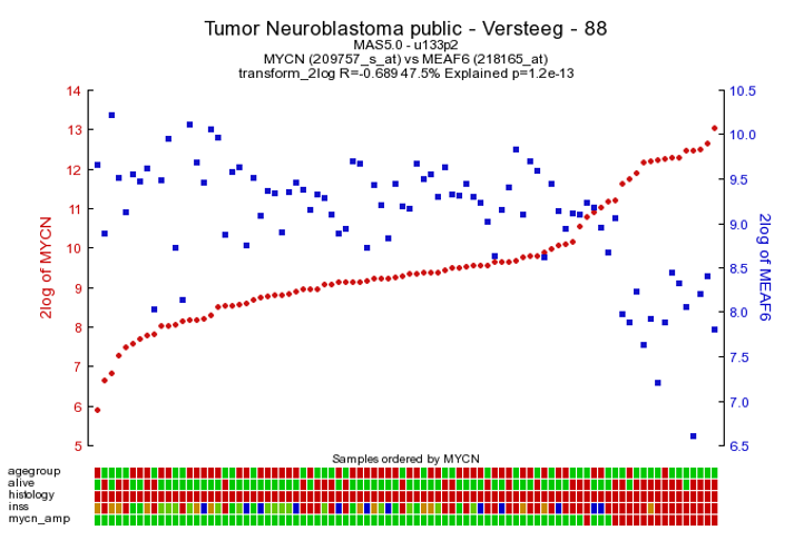
Figure 5: The expression of MYCN has a negative correlation with that of the MEAF6 gene
To generate a correlation plot where the negative relationship between MYCN and the MEAF6 gene is more clearly visualized, select “XY-plot” as graph type in the graphics section in the Adjustable Settings box and click the “Adjust Settings” button. In this correlation plot it is also still possible to show expression levels for the samples are distributed. In order to do so, click on more settings in the Adjustable Settings box, set Histogram to yes, and click on the Adjust Settings button. Now the histogram boxes in the x and y axes show the distribution of the expression levels in the correlation plot, see fig 6.
Another nice way to adjust the graphical representation of a XY plot is by using the gene expression levels and applying these to a color gradient.
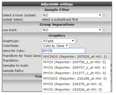
Figure 7: Select Color by gene
Select in the “Color Mode” pull down menu the “Color by gene” option. In the next box enter the gene you want to use for coloring the dots. Make sure that after entering the gene name you also select a corresponding probeset and click “Adjust Settings”. In this example the reporters of the MYCN vs MAEF6 are plotted and subsequently colored by the MYCN expression levels. Of course, you can also enter a third gene for coloring the dots.

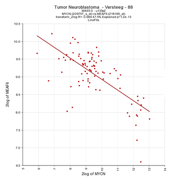
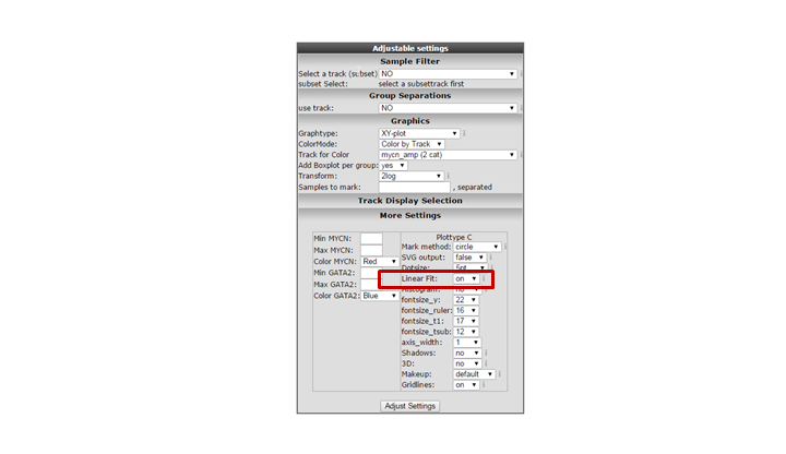
Another way to visualize the relationship of the expression correlation in an XY plot is to switch on the linear fit option. In the “More settings section”, turn on “linear fit”.

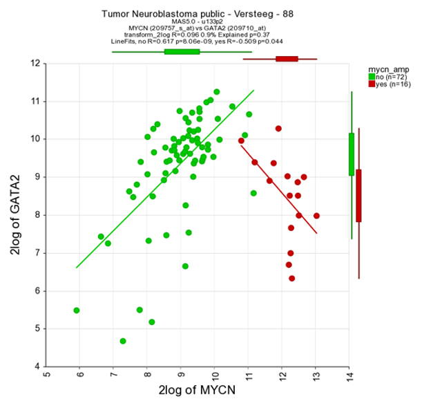
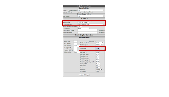
It could be that you encounter a correlation plot for two genes where you can distinguish two clusters. One group of the samples seems to form a cluster with a positive correlation and a second cluster seems to have an inverse correlation. An example, which is not directly listed in previous list of correlating genes, is the relationship between MYCN and GATA2. In the right upper corner enter MYCN and the GATA2 gene and click ‘Change Genes’. Change the color mode to “Color by track”, select the MYCN track in the graphics section, turn on the linear fit option at ‘More settings’ as indicated below, and click redraw.

In de next figure, the trend line clearly illustrates that there is positive correlation for the MYCN non-amplified group and a negative correlation for the MYCN amplified group.
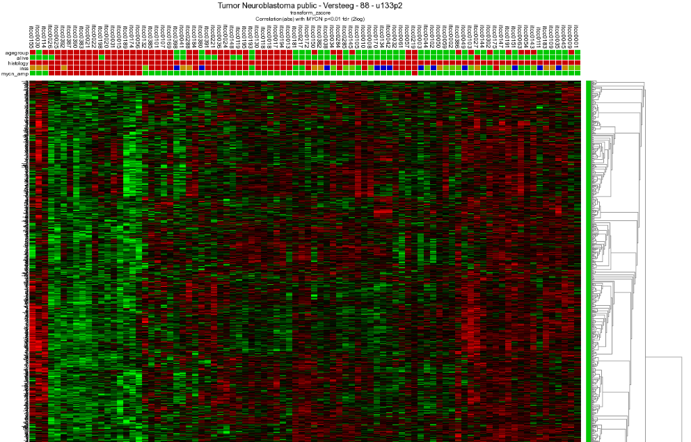
Through the menu on the right, several additional dataviews and analyses are available. Let us start with different overviews; R2 is able to produce heatmaps of this analysis. Return to the genelist view (Figure 2). Click on the ‘Heatmap (zscore)’ in the right menu. The gene names are on the y-axis, sample names on the x-axis.
7.5. Step 4: Relation with Chromosome position
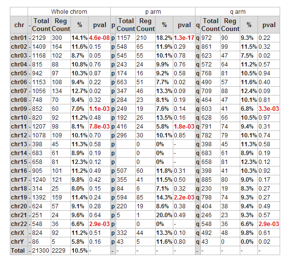
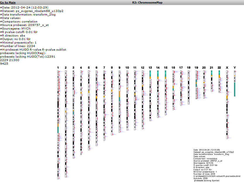
Another possible view is the mapping of these genes on all chromosomes. Click on the ‘Chromosome Map’ menu item again in the menu on the right in Figure 2. In Figure 13, the overrepresentation of genes that correlate with MYCN expression with respect to all genes present on (an arm of) a chromosome is calculated. In Figure 14 this mapping is depicted in an overview. Sometimes, eyeballing already suggests that some regions seem to be affected. R2 provides a table where the statistics behind this analysis are given. You can also explore the results in the interactive R2 genome browser, where you can zoom into the results and locate individual genes. To enter this mode, just press the ‘View in R2 genomebrowser’ button.
![]() Did you know that over-representation is explained here?
Did you know that over-representation is explained here?
Over-representation quantifies the notion that a subset of genes from a larger set can harbor more genes that have a certain characteristic than you would expect by chance. On the p-arm of chromosome 1 for example, there are 1157 genes located of the grand total of 21300 known genes. From our set of 2229 genes (only slightly more than 10% of the total number) some 210 are present on this arm. This is 18.2%, an enrichment above what you would expect by chance. This can be quantified using a 2X2 contingency table with a chi-squared test that produces a p-value to establish whether this difference is significant.

Figure 15: Mapping of the genes correlating with MYCN on allchromosomes
To further explore this set of genes return to the list: Figure 2.
7.6. Step 5: Establishing overrepresentation in other domains
Further overrepresentation analyses in other domains can give a first clue of the processes that are of importance in this set of genes. A domain is the Gene Ontology; a controlled vocabulary that systematically describes processes, locations and functions in biology. Click ‘Gene Ontology analysis’.
The resulting categories are presented in a sortable table (Figure 15). It is possible to sort on p-value by clicking on the column header. Clicking on a pathway ID will open a new screen or tab with the heatmap of the selected pathway.
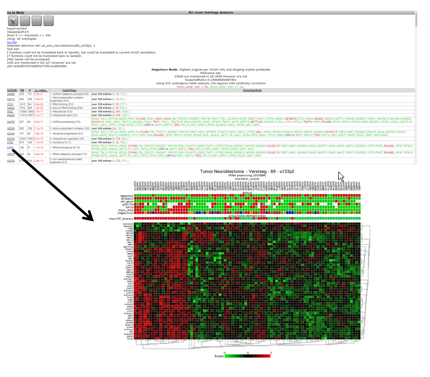
One of the categories where genes of our current set are overrepresented is ‘DNA-strand elongation’. All genes in this process have a consistent positive correlation (as can be seen by the green color). Let us take a look to see if we can corroborate this observation in another domain.
The adjustable panel settings menu allows you to redo the gene-ontology analysis with the up or down regulated genes only.
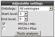
Figure 17: Re-do analysis with genes that are either positively or negatively correlated with MYCN.
7.7. Step 7: Gene list in pathway context
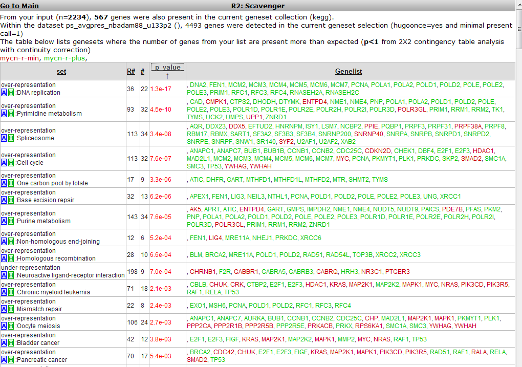
Return to the gene list Figure 2 and click ‘Map on pathway image’.
A similar overrepresentation analysis is performed on all gene members of the pathways in the KEGG database. Click on the p-value column header again to find the most significant ones: Figure 17.

The DNA-replication pathway pops up as most significant. Note that most genes are similar to those found by the GO process in the former analysis. The pathway will be shown when the blue “A” in front of the pathway name is clicked.
A hyperlinked KEGG pathway appears: Figure 18.
 Figure 19: Mapping of the overrepresented genes (darker green) in the MYCN
correlating set on the DNA-replication pathway from the KEGG database. Hovering over the gene shows additional information
Figure 19: Mapping of the overrepresented genes (darker green) in the MYCN
correlating set on the DNA-replication pathway from the KEGG database. Hovering over the gene shows additional information
MCM-genes seem to play a role. Go back to list (Figure 2) to show their individual relation with MYCN.
7.8. Step 8: Further pathways analysis
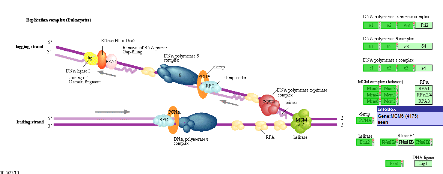
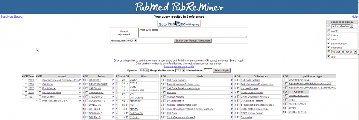
Scroll down and look for the MCM2 gene, click on the link to show their relationship: Figure 16.
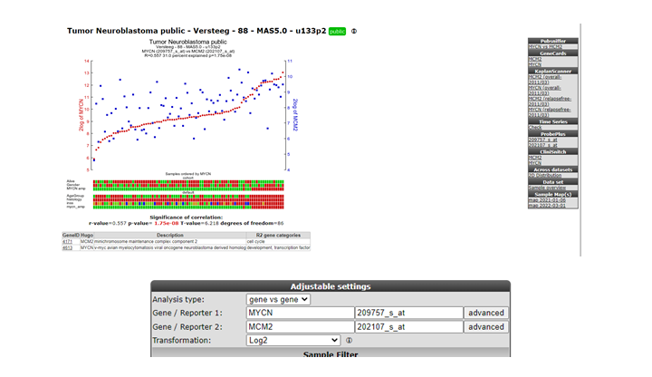
The correlation is significant. In the left upper table there is a link to the Pubsniffer tool within R2. This tool performs a live search in the Pubmed literature database for (co-)occurrences of MYCN and MCM2 (and some other keywords). Click the link: Figure 17.
Figure 21: Pubsniffer results for gene symbols MYCN and MCM2
Apparently there are some abstracts where the two genes are mentioned together, you can view this article directly by clicking the hyperlinked number in the Articles column. The outlink Pubreminer column directs to the PubReminer tool:
This versatile tool offers quite some functionality to build a literature search query tailored to your needs. That being slightly out of scope of this tutorial, click the “Go to Pubmed with query” button to find the article.
This article is actually published work by our group where the relation between the MCM genes and MYCN was proven experimentally.
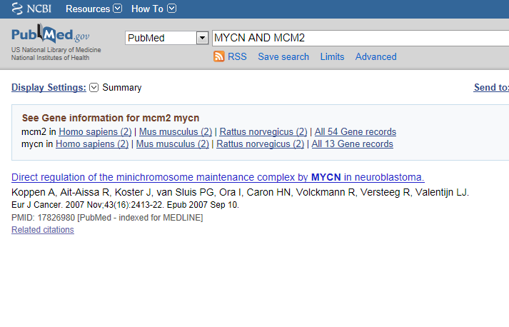
Figure 23: The correlation between MCM genes and MYCN was proven experimentally in this article.
7.9. Step 9: Gene set analysis
- The genelist produced in the beginning of this tutorial (Figure 2) can be stored for use in later analyses in R2, or for use in other applications. Return to the page containing the list, this is still open in another tab in your browser.
- The menu to the right gives several possibilities (Figure 2). Some of these have been explored already; we will shortly touch on the rest of them.
- “Gene set analysis”: use public genesets; this is further explored in the advanced Correlate with DataSet tutorial.
- “Map on pathway image”, “Chromosome map”, “Gene Ontology analysis”, “Heatmap” have been explored in this tutorial.
- “MakeMeATable” produces a txt file that is formatted for direct input into another data analysis tool such as TM4.
- “Save current selection as TXT file” produces a tab separated file containing the current analysis. In the header of such file all information is stored to be able to redo the analyses in the future.
- Reference for current selection produces a list of probesets and genenames that are considered to be expressed in the current dataset. This is a suitable background set for eg. the DAVID tool DAVID.
- Last but not least, the data can be stored as a personal genecategory; this is further explored in the advanced tutorial “Adapting R2 to your own needs”.
7.10. Final remarks / future directions
Based on this tutorial you can further explore R2 in the set of advanced tutorials.
Everything described in this chapter can be performed in the R2: genomics analysis and visualization platform (http://r2platform.com / http://r2.amc.nl).
We hope that this tutorial has been helpful,the R2 support team.