11. K-means clustering in R2
How to discover novel groups or subtypes in your dataset using k-means clustering
11.1. Scope
- In this tutorial expression data of a set of Medulloblastoma tumors will be investigated for the occurrence of groups that have similar expression patterns.
- Affymetrix data will be used in a k-means clustering analysis.
11.2. Step 1: Selecting data and module
Make sure that the Single Dataset option is selected in field 1 of the step by step guide.
In field 2 locate and select the ‘Tumor Medulloblastoma PLoS One- Kool - 62 MAS5.0 -u133p2’ dataset by clicking ‘Change Dataset’
In field 3 choose the ‘K-means’ option (Figure 1)
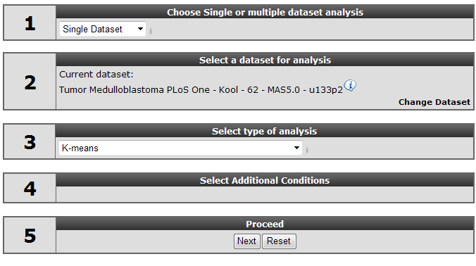
Click ‘next’
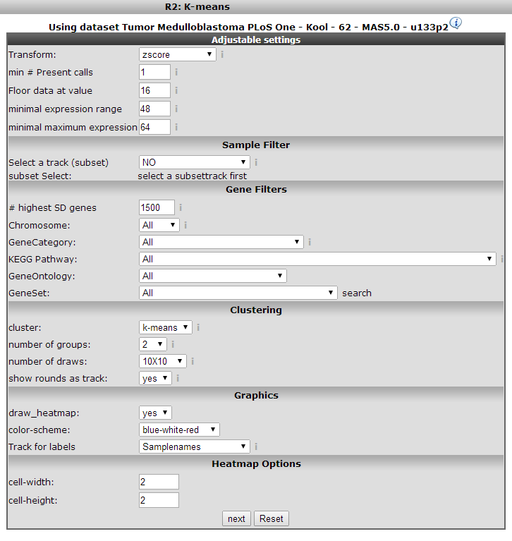
11.3. Step 2: Adapting settings
The next window presents a set of fields where specific settings of the clustering algorithm used can be set. There are only a few settings immediately relevant, the others are appropriate for most analyses. For the k-means clustering these are the number of groups and the number of draws. We’ll explain these shortly; for other settings refer to the boxed items.
K-means clustering requires a number of groups beforehand, we start with two. To see whether the outcome of the clustering is stable (see boxed text on K-means clustering) we set the number of draws (performing of the calculation) to 10x10.

Dependending on the size of your dataset or geneset you can enlarge of minimize your K-means plot by adapting the size of the rectangles at heatmap option. click ‘next’
![]() Did you know that K-means is a method of cluster analysis?
Did you know that K-means is a method of cluster analysis?
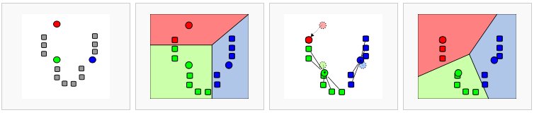
In data mining, k-means clustering is a method of cluster analysis which aims to partition n observations into k clusters in which eachobservation belongs to the cluster with the nearest mean. This mightsound complicated but is easily illustrated: suppose we have a set of 12 patients where we observe the expression of two genes; expression ofgene 1 along the x-axis, gene 2 on the y-axis (in our situation we have much more genes; the calculation will then be done in more dimensions). We’re now going to try to cluster this set of n patients observed inthree groups; k = 3. The following steps illustrate the algorithm (1-4from left to right) # k = 3 initial “means” are randomly selected inthe data set (shown in color) # k clusters are created by associatingevery observation with the nearest mean. This partitions 2-D plane (the so called dataspace) in three areas. # The initial means are moved tothe centers of the three areas; the centroids. # Steps 2 and 3 arerepeated until convergence has been reached. As is obvious from the end point from this calculation this is a heuristic algorithm, there is noguarantee that it will converge to the global optimum, and the resultmay depend on the initial, randomly assigned clusters. As the algorithm is usually very fast, it is common to run it multiple times withdifferent starting conditions and compare the outcome. R2 visualizesthis in the end result of the calculation.
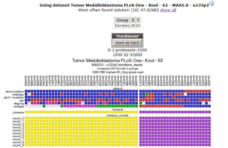
11.4. Step 3: Examining resulting clusters
R2 clusters the samples using the expression of 1500 genes exhibiting the highest standard deviation in this set. The result of 10 sets of 10 calculations each, is shown as colored bars (Figure 3). Below the bars a heatmap is shown of the expression of the genes involved. It is obvious that two consistent clusters are formed; the assignment of the samples to a respective cluster is always the same. Note that figures reproduced by yourself might differ slightly when weaker associations are investigated; k-means is non-deterministic (random initiation).

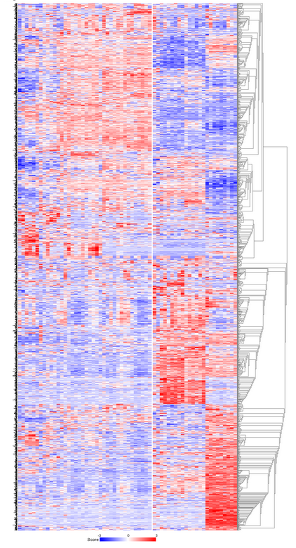
For visualization of k-means clusters, R2 performs hierarchical clustering on the samples for every group of k. Finally a hierarchical clustering is performed on the genes, making use of the information present in all samples. Because this is a large set only part of the map is shown in Figure 4. Below the heatmap, R2 will automatically test the the association between the newly created kmeans separation and all of the tracks that are available for the current dataset (Fisher’s Exact Tests). This allows for quick discovery of interesting correlations that may yield biological insights. Depending on the availability of survival information, also a Kaplan Meier analyses can be added to the analysis (and for example be compared to KaplanScan results for exemplar genes).
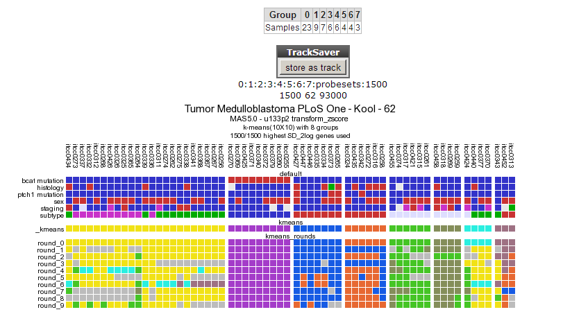
This dataset has a clinical annotation for BCAT mutations; the upper bar or track in Figure 3. The subgroup having this annotation seems to cluster together in one of the two groups; this is however a subset of one of the two current clusters; more groups are expected. We’re going to use a larger value for k to investigate this. In your browser click the back button and change the number of groups to 8.
Click ‘next’.

![]() Did you know that ‘the # highest SD genes is the number of genes with highest Standard Deviation?
Did you know that ‘the # highest SD genes is the number of genes with highest Standard Deviation?
Most of the other options (Sample/Gene filters etc) are explained in former tutorials. The “# highest SD genes” is the number of genes with highest Standard Deviation (genes that ‘make a difference’ in this set) that is used for the K-means analysis. By default this value is 1500.
![]() Did you know that some virus scanners slow drawing of these graphs??
Did you know that some virus scanners slow drawing of these graphs??
If R2 takes a long time to draw images like these this might have to do with your virus scanner. The graphs are interactive and contain a lot of scripts that are usually scanned by a virus-scanner like McAffee. You can avoid this by disabling Script scanning.
11.5. Step 4: Creating consistent clusters
The resulting clustering in 8 groups is depicted in Figure 5

Figure 5: Clustering in 8 groups produces no consistent outcome.
The outcome is not consistent (except for the cluster of samples having a bcat mutation)
Repeat the procedure for 4 groups.
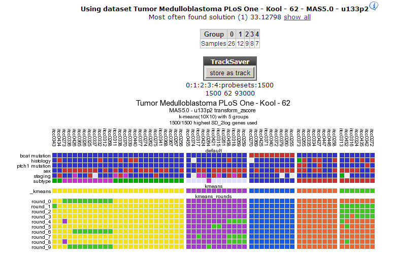
In Figure 6 a clear and almost perfect clustering in 4 groups is established. Kool e.a. (2008) identified 5 subtypes in Medulloblastoma; this set is annotated in the lower track above the k-means tracks; they neatly follow 3 out of 4 clusters; the remaining two subtypes are less clear as is also clear when we try to separate the data in 5 clusters (Figure 7). By choosing subsets (categories) of genes before clustering you might be able to determine more precisely defined groups. An example of this method can be found in the Adapting R2 tutorial.
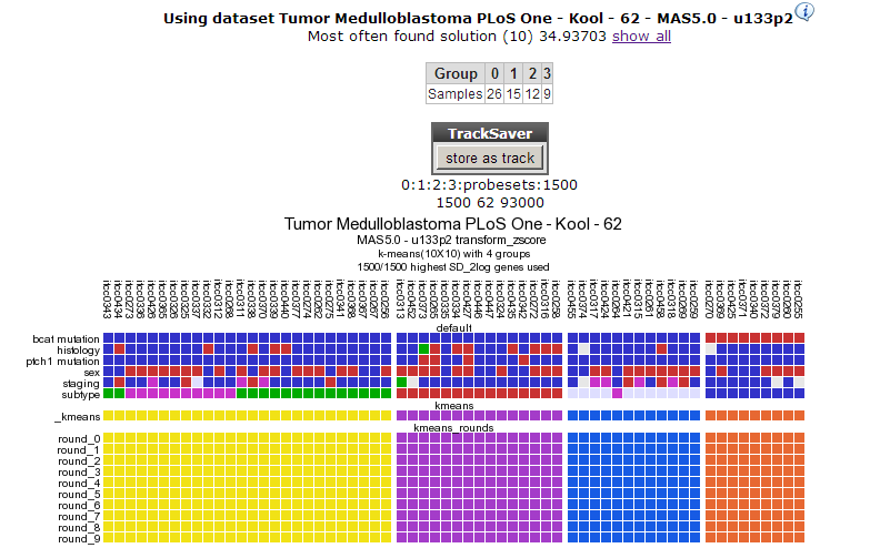
Figure 6: Consistent clustering for 4groups.

11.6. Final remarks / future directions
The identification of medulloblastoma subtypes has been published here: Kool M, Koster J, Bunt J, Hasselt NE, Lakeman A, van Sluis P, Troost D, Meeteren NS, Caron HN, Cloos J, Mrsic A, Ylstra B, Grajkowska W, Hartmann W, Pietsch T, Ellison D, Clifford SC, Versteeg R.; Integrated genomics identifies five medulloblastoma subtypes with distinct genetic profiles, pathway signatures and clinicopathological features. PLoS One. 2008 Aug 28;3(8):e3088.
We hope that this tutorial has been helpful,the R2 support team.